Julia Kuczyńska │ UX designer

The expanding platform is getting out of hand - new structure and navigation for Houzy app

Dec 2021 - Oct 2022

Mobile mockups

Context and challanges

Houzy is a platform for property owners, buyers and sellers. 
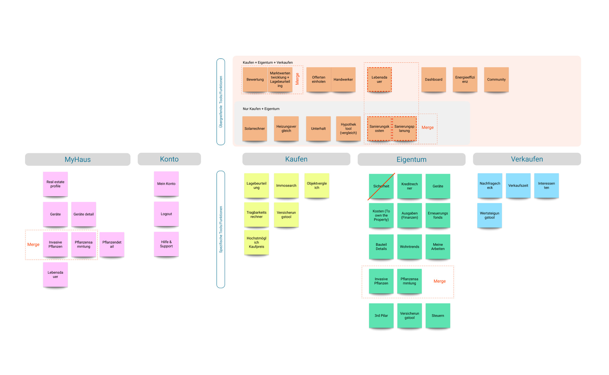
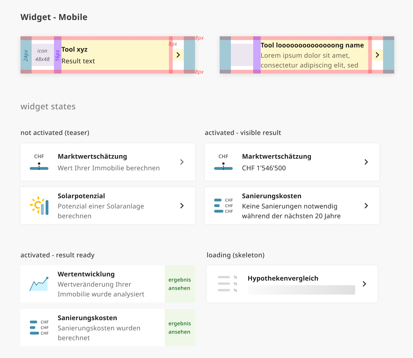
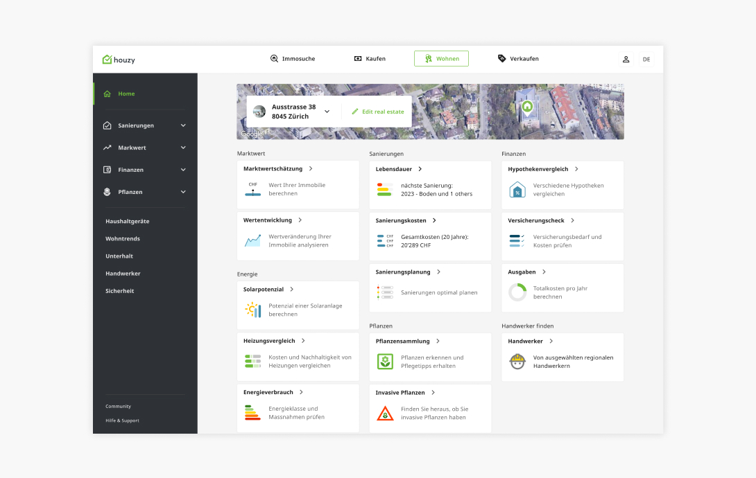
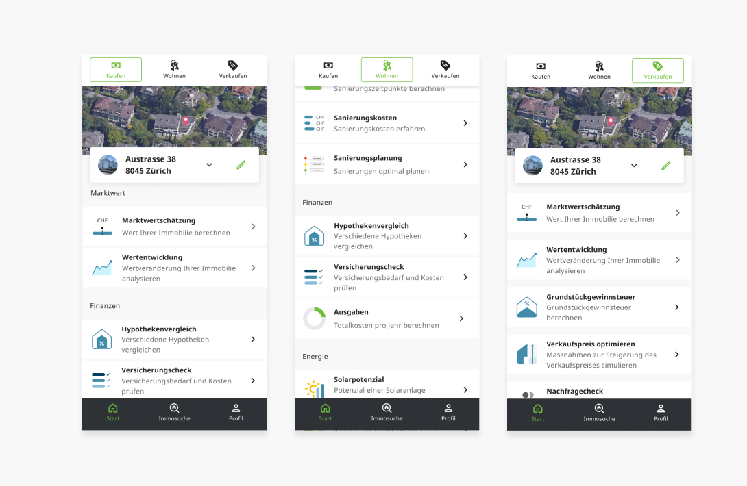
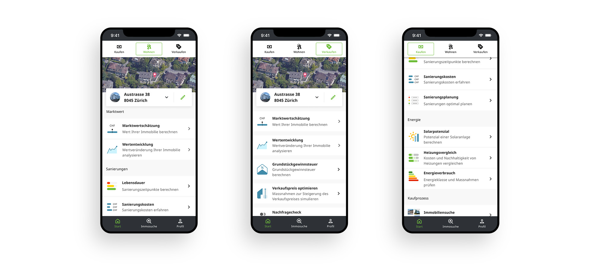
The open ecosystem integrates user-friendly online tools such as property valuation, energy calculator, mortgage comparison, property search and more. It also connects users, craftsmen and other property experts with a single click.

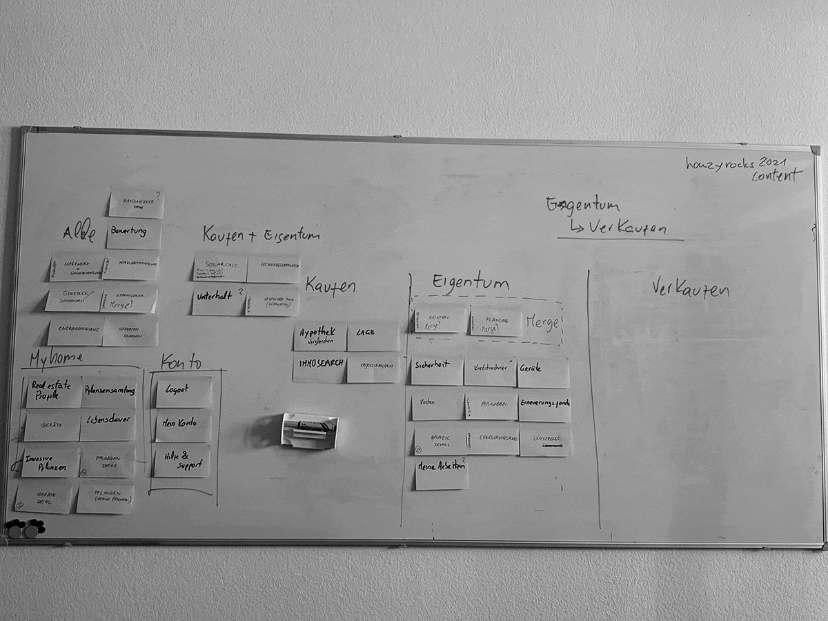
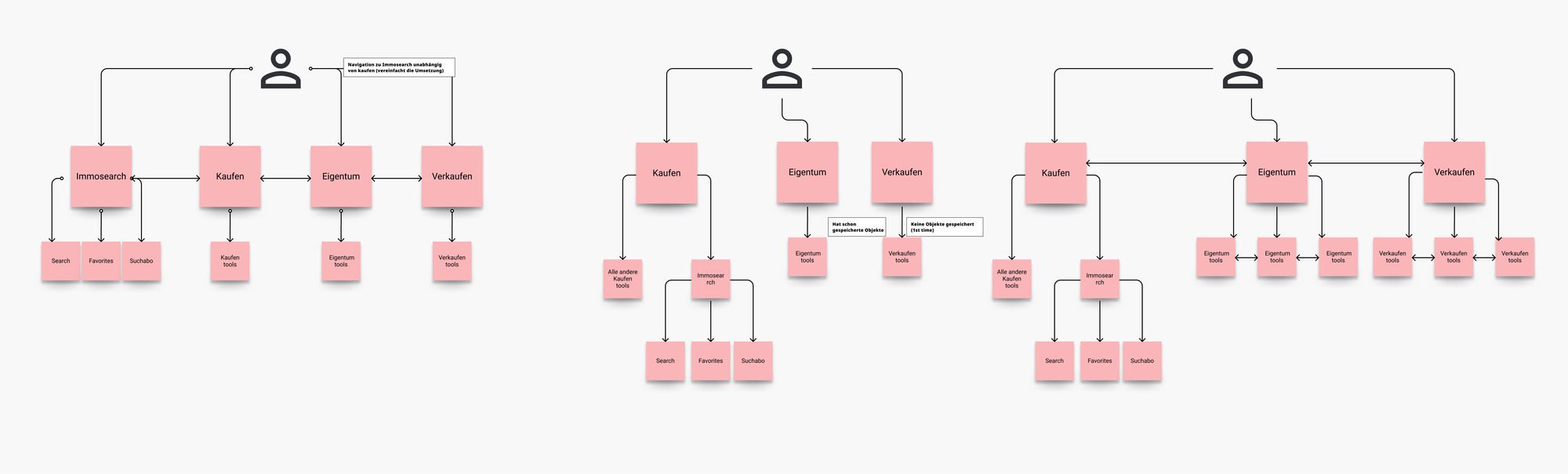
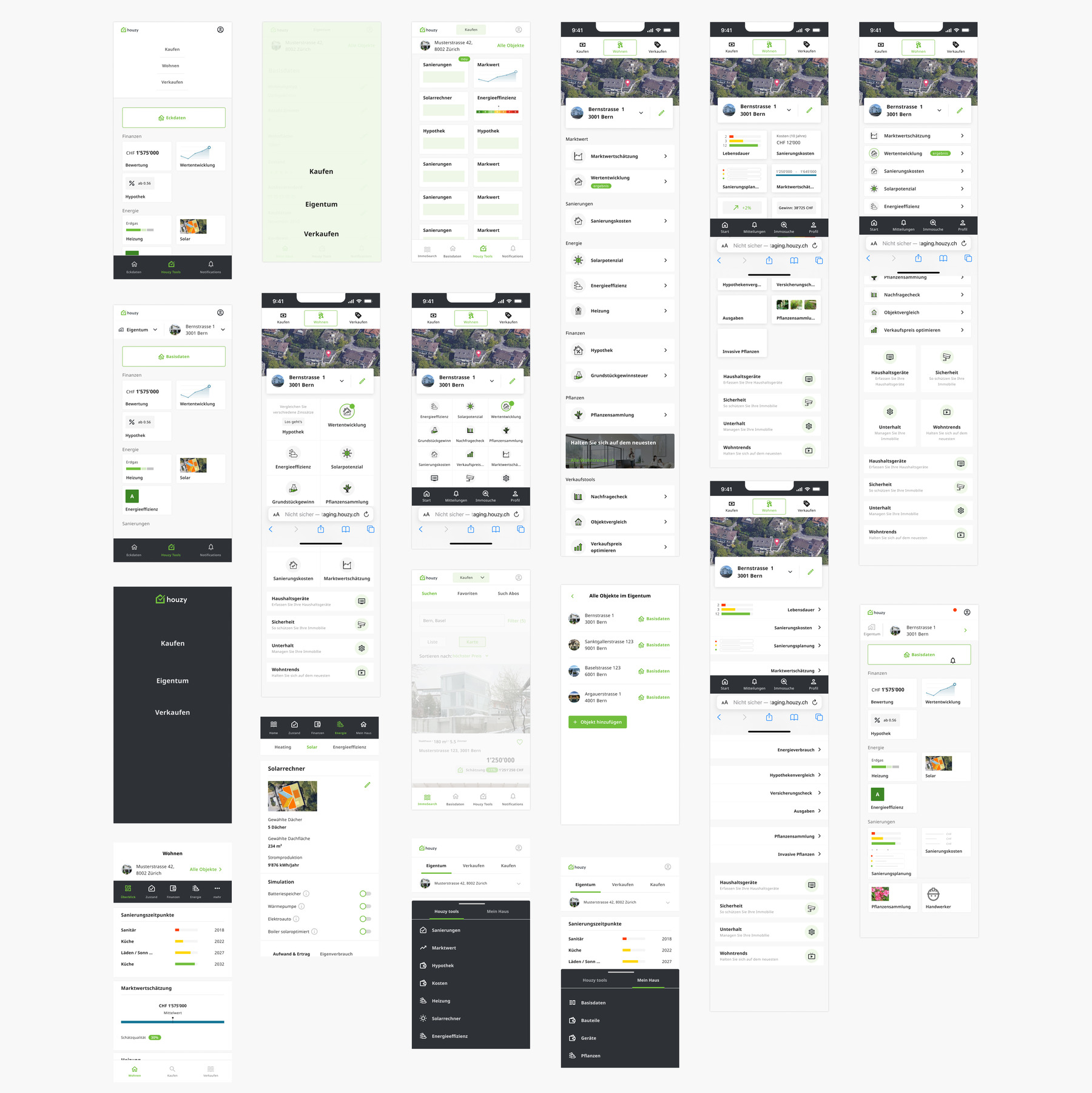
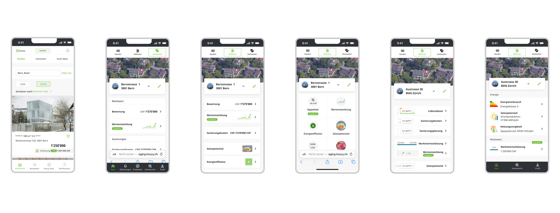
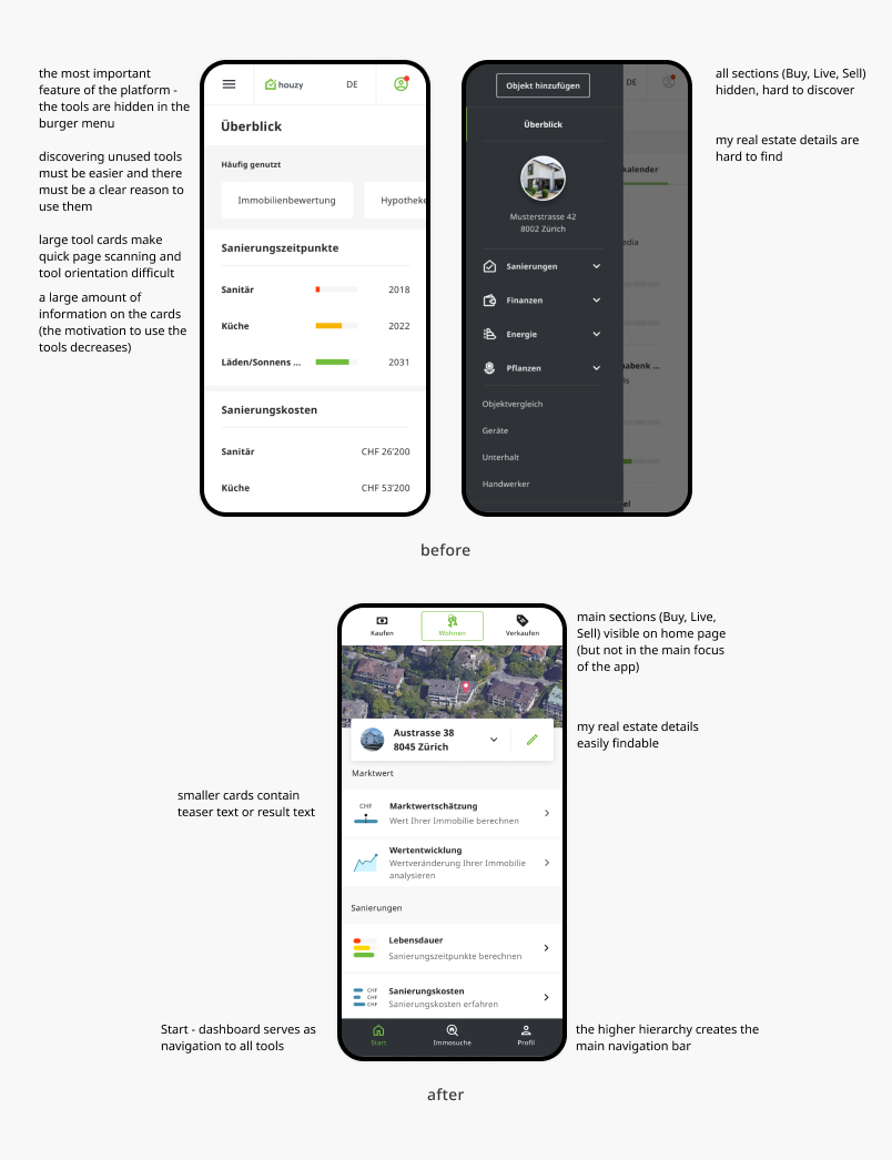
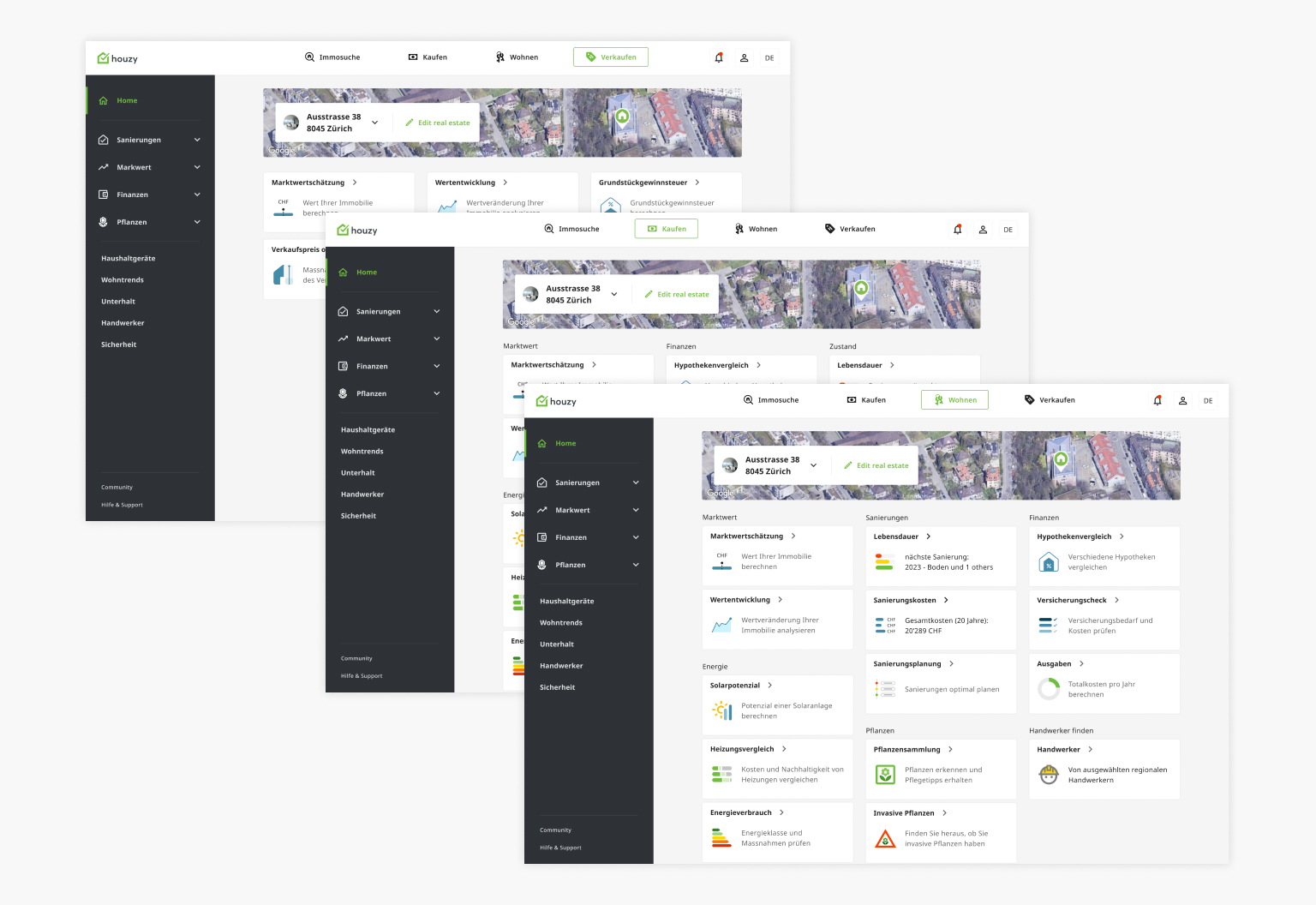
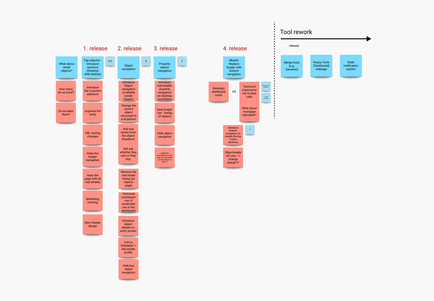
In 2018, the platform started for homeowners with basic real estate tools for one home per user. It grew to help buyers, sellers, and owners of different properties. Users can add multiple objects, like houses and apartments, and use a smart property search for sales. But the platform's expansion made it hard to navigate and understand.

My role

As one of the two UX/UI designers on the team, my responsibilities included:
• information architecture concept,
• prototyping and usability testing,
• UI, interaction design,
• developer handoff,
• monitoring and testing of the implemented designs, ensuring flawless execution.

Result

While exact figures are not yet available, preliminary results such as recordings and product analytics are promising. They indicate that restructuring the site has significantly improved usability, made navigation easier, and increased tool usage. We are excited to collect more data as testing progresses.

Process & Solution

Pictures of postits hanging on a board Mobile mockups Diagram Early information architecture diagrams
Defining new hierarchy and information architecture
Early sketches and first ideas
Early sketches. I designed and experimented with different approaches to solve the problem.
Early sketches and first ideas
Consolidation and usability testing sessions.
Mobile mockups before and after
Starting with mobile. Replacing hamburger menu with an easily accessible navigation.
Desktop design
Adjusting desktop navigation
Icons representing the tools User interface design for dashboard components
Redefining component logic. Mobile widget redlines and states.
Value development card in four languages
Different state and labeling in all platform's languages.
Postits with release plan
The implementation was divided into several chunks and carried out over several months. Throughout the process, we regulary conducted test sessions with existing users and people who have never seen the platform. Those sessions had a key impact on the final result.
Desktop mockup Mobile mockup
A man with a mobile checking houzy app Desktop and mobile mockups

← back home